
CSS: 유용한 속성들
1. 알파채널과 불투명도
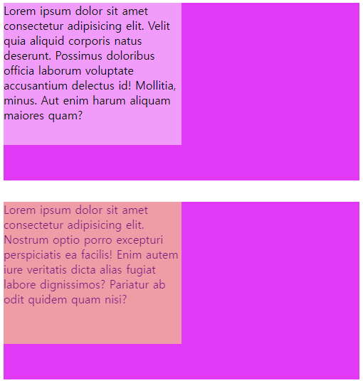
투명도를 0~1 사이의 값으로 지정할 수 있다.
- rgba(rde, green, blue, alpha): 하위 요소에 영향을 주지 않음. 16진수의 칼라값에 투명도를 설정하려면, VS code 에서 제공하는 칼라 선택기를 사용.
- opacity: 부모요소에 설정한 투명도가 하위요소 모두에 영향을 줌
#rgba_alpha {
    background-color: magenta;
    width: 500px;
    height: 250px;
}

/* rgba 로 불투명도 설정 시, 하위요소의 불투명도는 영향받지 않음*/
#rgba_alpha div {
    background-color: rgba(255, 255, 255, 0.5);
    width: 250px;
    height: 200px;
}

#opacity {
    background-color: magenta;
    width: 500px;
    height: 250px;
    margin-top: 30px;
}

/* opacity 로 불투명도 설정 시, 하위요소의 불투명도도 영향을 받음 */
#opacity div {
    background-color: yellow;
    opacity: 0.5;
    width: 250px;
    height: 200px;
}
2. 위치 속성
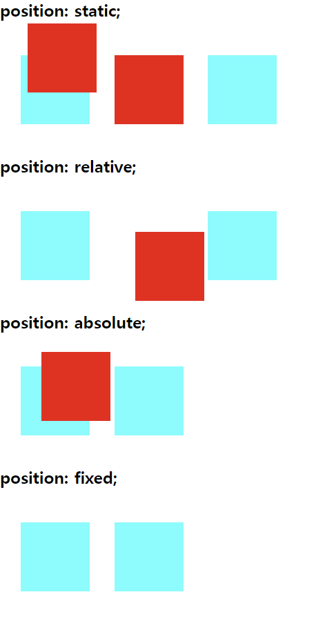
문서에서 요소를 배치하는 방법을 지정하는데, top, right, bottom, left 속성이 요소를 배치할 최종 위치를 결정한다.
-
position: static; 디폴트 위치지정 속성이며, top, right, bottom, left 속성이 영향을 주지 못함
-
position: relative; 요소를 일반적인 문서 흐름에 따라 배치하고, 자기자신의 위치를 기준으로 top, right, bottom, left 의 값에 따라 오프셋을 적용한다. 오프셋은 다른 요소에 영향을 주지 않는다.
-
position: absolute; 요소를 일반적인 문서흐름에서 제거하고, 페이지 레이아웃에 공간도 배정하지 않는다. 대신 가장 가까운 위치지정 조상 요소에 대해 상대적으로 배치한다. 단, 조상 중 위치가 없다면 초기 컨테이닝 블록을 기준으로 삼는다.
-
position: fixed; 요소를 일반적인 문서흐름에서 제거하고, 페이지 레이아웃에 공간도 배정하지 않는다. 조상 중 위치가 없다면 초기 컨테이닝 블록 위치의 ‘상단’ 에 고정시킨다.
-
position: sticky; 참조링크를 참고하자(아직 어렵다 ㅎㅎ)
/* 위치지정 속성(static)은 top, bottom, left, right 속성에 영향을 주지 않음 */
#pos_static #middle {
    position: static;
    top: 30px;
    left: 30px;
}

/* 위치지정 속성(relative)은 자기자신의 위치를 기준으로 오프셋을 적용 */
#pos_relative #middle {
    position: relative;
    top: 30px;
    left: 30px;
}

/* 위치지정 속성(absolute)은 조상요소에 대해 상대적으로 배치
만약 조상요소에 위치지정 속성이 없다면, 초기 컨테이닝 블록을 기준으로 함 */
#pos_absolute {
    position: relative;
}

#pos_absolute #middle {
    position: absolute;
    top: 30px;
    left: 30px;
}

/* 위치지정 속성(fixed)은 조상요소에 대해 상대적으로 배치
만약 조상요소에 위치지정 속성이 없다면, 초기 컨테이닝 블록을 기준으로 '상단'에 고정 */
#pos_fixed #middle {
    position: fixed;
    top: 10px;
    left: 10px;
}
3. CSS: transition
transition 은 주로 호버와 함께 사용하며, 하나의 상태에서 다른 상태로 바뀔 때 즉 애니메이션 효과를 주고 싶거나 마우스 포인터를 강조하고 싶을 때 사용한다.
transition 은 특정한 속성에 ‘타이밍’ 을 지정할 수 있다.
.circle {
    width: 200px;
    height: 200px;
    background-color: magenta;

    /* 3초 동안 배경색 변경 */
    transition: background-color 3s;

    /* 1초 후, 3초 동안 배경색 변경 */
    /* transition: background-color 3s 1s; */

    /* 배경색은 0.5초, 테두리는 3초 동안 동시에 변경 */
    /* transition: background-color 0.5s, border-radius 3s; */
}
trans-timing-function 은 다양한 transition 효과를 적용할 수 있다.
.circle:hover {
    background-color: aqua;
    border-radius: 50%;
}

/* 부모(section)에 마우스를 얹을 때, 자식(sqaure)가 왼쪽에서 오른쪽으로 이동하는 transition */
section .square {
    width: 100px;
    height: 100px;
    margin-top: 30px;
    background-color: aquamarine;
    transition: 3s;
}

/* transition 은 전환 전과 후의 요소 지정자 이름이 반드시 동일해야 해야 작동함 */
section:hover .square {
    margin-left: 500px;
}

.square:nth-of-type(1) {
    transition-timing-function: ease-in;
}

.square:nth-of-type(2) {
    transition-timing-function: ease-out;
}

.square:nth-of-type(3) {
    transition-timing-function: cubic-bezier(0.65, 0, 0.35, 1);
}

.square:nth-of-type(4) {
    transition-timing-function: cubic-bezier(0, 0.55, 0.45, 1);
}
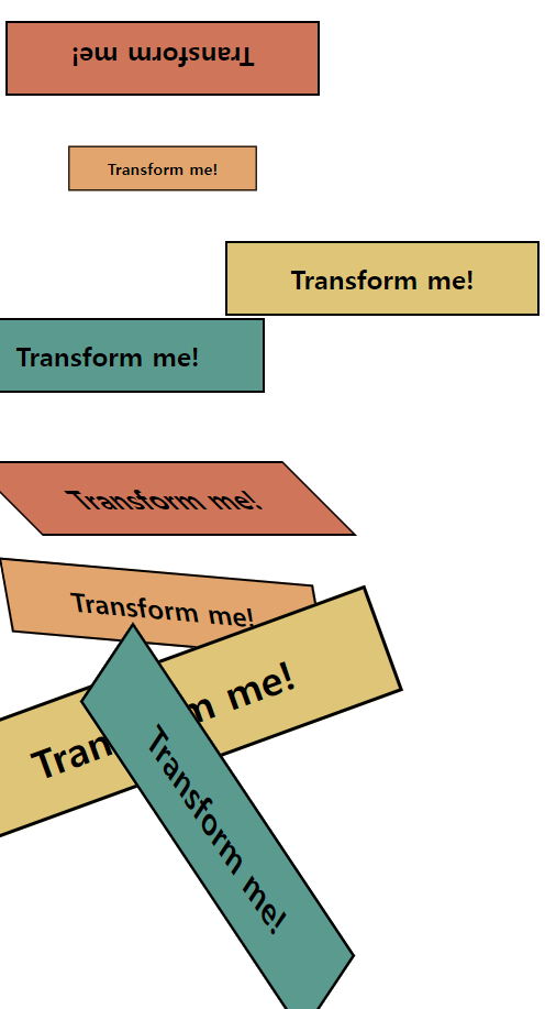
4. CSS: transform
요소에 회전(rotate), 크기 조절(scale), 기울이기(skew), 이동하기(translate) 를 부여할 수 있다.
h1 {
    width: 250px;
    padding: 1rem;
    border-style: solid;
    border-width: 2px;
    margin-top: 2rem;
    text-align: center;
}

h1:nth-child(1) {
    background-color: #e76f51;
}

h1:nth-child(2) {
    background-color: #f4a261;
}

h1:nth-child(3) {
    background-color: #e9c46a;
}

h1:nth-child(4) {
    background-color: #2a9d8f;
}

/* 180도 회전 */
section:nth-child(1) h1:nth-child(1) {
    transform: rotate(180deg);
}

/* 0.6 크기 적용 */
section:nth-child(1) h1:nth-child(2) {
    transform: scale(0.6);
}

/* 오른쪽으로 200만큼 이동 */
section:nth-child(1) h1:nth-child(3) {
    transform: translateX(200px);
}

/* 왼쪽으로 50만큼, 위쪽으로 30만큼 이동 */
section:nth-child(1) h1:nth-child(4) {
    transform: translate(-50px, -30px);
}

/* 오른쪽으로 45도 기울이기(잡아당기기) */
section:nth-child(2) h1:nth-child(1) {
    transform: skew(45deg);
}

/* 오른쪽으로 10도, 왼쪽으로 5도 기울이기(잡아당기기) */
section:nth-child(2) h1:nth-child(2) {
    transform: skew(10deg, 5deg);
}

/* transform 속성 중복 적용하기(1) */
section:nth-child(2) h1:nth-child(3) {
    transform: rotate(-20deg) scale(1.5);
}

/* transform 속성 중복 적용하기(2) */
section:nth-child(2) h1:nth-child(4) {
    transform: scaleY(1.5) translateX(50px) rotate(45deg);
}
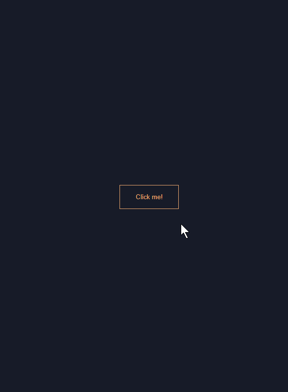
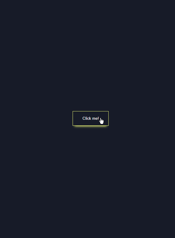
5. 멋진 버튼 hove 효과 만들기
body {
    font-family: Georgia, 'Times New Roman', Times, serif;
    background-color: #151b29;

    /* 화면 정중앙에 콘텐츠 배치 */
    display: flex;
    align-items: center;
    justify-content: center;
    height: 100vh;
}

button {
    background: none;
    border: solid 1px #ffa260;
    color: #ffa260;
    padding: 1rem 2rem;
    transition: 0.25s;
}

button:hover {
    border-color: #f1ff5c;
    color: white;
    cursor: pointer;
    /* boxshadow 효과 */
    box-shadow: 0 0.5rem 0.5rem -0.4rem #f1ff5c;
    transform: translateY(-0.25rem);
}
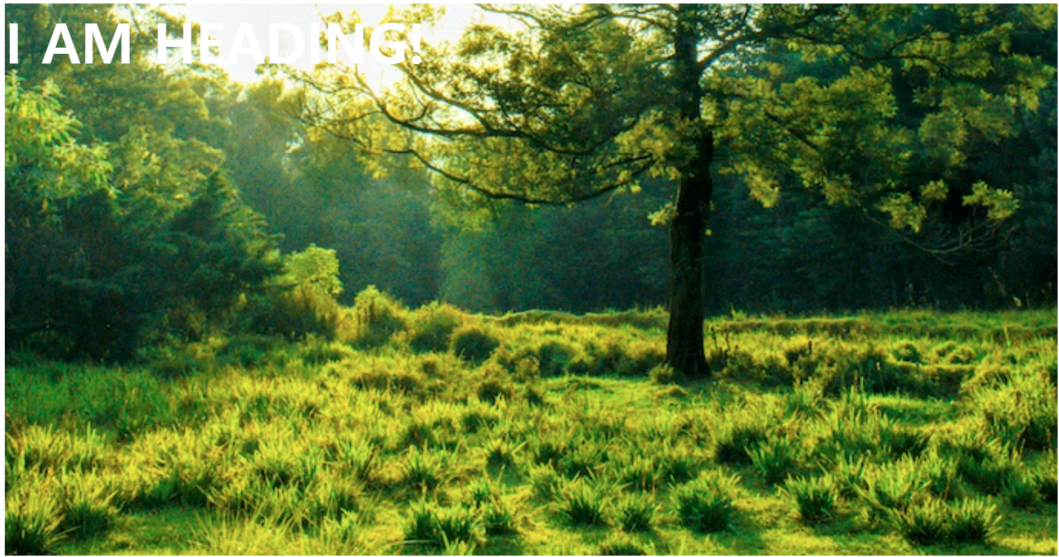
6. CSS: background
배경의 색상(color), 이미지(image), 원점(position), 크기(size), 이미지 반복(repeat) 을 설정할 수 있다.
-
background-size: contain 은 잘림없이 그대로 배경 이미지가 나오지만, 이미지가 반복되는 경우가 있어 ‘cover’ 를 더 자주 사용한다.
[속기법 사용 안함]
section {
    width: 80%;
    height: 800px;

    /* 배경이미지 추가 */
    /* 마우스우클릭 > 이미지 주소 복사 */
    background-image: url("https://images.unsplash.com/photo-1501183007986-d0d080b147f9?ixlib=rb-1.2.1&ixid=MnwxMjA3fDB8MHxwaG90by1wYWdlfHx8fGVufDB8fHx8&auto=format&fit=crop&w=687&q=80");

    /* 배경이미지 크기 설정
    content 는 잘림없이 나오지만, 이미지가 반복됨
    cover 는 반복되지 않지만, 잘림 */
    background-size: cover;

    /* 배경이미지의 위치 설정 */
    background-position: bottom;

    margin: 0 auto;
}
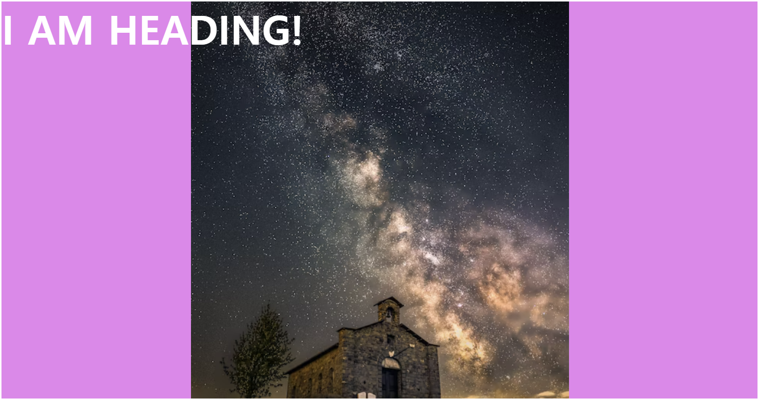
[속기법 사용]
section {
    width: 80%;
    height: 800px;
    /* 속기법 */
    /* background-size 는 position 뒤에 '/'와 함께 사용 */
    background: violet no-repeat center/50% url("https://images.unsplash.com/photo-1661763633567-bd27413154e6?ixlib=rb-1.2.1&ixid=MnwxMjA3fDB8MHxlZGl0b3JpYWwtZmVlZHwxMHx8fGVufDB8fHx8&auto=format&fit=crop&w=500&q=60");

    margin: 0 auto;
}
7. Google Fonts 사이트 활용
-
임베드 하기 원하는 폰트 선택 → 우측 사이드 바에서 link 선택 → HTML 코드를 head 에 추가 → CSS code 를 규칙에 따라 추가
/* HTML 페이지의 head에 Google Font 링크 추가
<link rel="preconnect" href="https://fonts.googleapis.com">
<link rel="preconnect" href="https://fonts.gstatic.com" crossorigin>
<link href="https://fonts.googleapis.com/css2?family=Noto+Sans+KR:wght@100;400&display=swap" rel="stylesheet"> */


/* body 가운데 정렬 셋팅 */
body {
    width: 800px;
    margin: 0 auto;
}

/* Google Font 의 CSS 규칙에 따라 폰트 스타일 적용 */
main {
    font-family: 'Noto Sans KR', sans-serif;
    font-weight: 400;
}

h1 {
    font-size: 48px;
}

h2 {
    font-size: 36px;
}

h3 {
    font-size: 32px;
}

p {
    font-size: 21px;
}
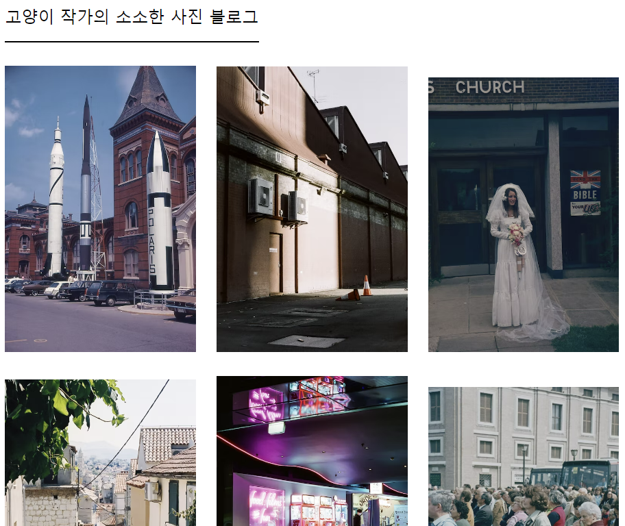
8. 사진 블로그 코딩하기
- 웹을 반응형으로 만들기 위해, % 단위로 크기나 여백을 계산하여 적용하는데, 이 때 ‘calc()’ 함수를 사용하면, 계산된 값을 쉽게 적용할 수 있다.
- HTML 의 단점인 ‘화이트 스페이스’ 문제를 피하기 위해 img 는 붙여쓰도록하자.
- font-size 지정없이 rem 단위를 사용하면, Chrome 의 경우, 16px가 디폴트 크기로 설정된다.
img {
    /* 부모요소(body)의 전체크기(100%)를 기준으로 자식요소(img)의 각 크기(30%)만 사용 */
    width: 30%;
    /* 남은 10%의 크기는 이미지 사이의 여백으로 사용, 10% / 6% = 1.6666% */
    /* margin: 1.6666%; */
    margin: calc(10%/6);
}

nav {
    font-size: 1.5rem;
    width: 40%;
    border-bottom: solid 2px;
    margin-left: calc(10%/6);
    padding-bottom: 1.2rem;
    margin-bottom: 1.2rem;
}

.rem_size {
    font-size: 24px;
    width: 40%;
    border-bottom: solid 2px;
    margin-left: calc(10%/6);
    padding-bottom: 1.2rem;
    margin-bottom: 1.2rem;
}
9. transform 과 transition 활용
- 회전하는 애니메이션
<div class="frame img1">360도 회전</div>
.frame {
    width: 100%;
    height: 600px;
    margin: 1.5rem;
    background-size:contain;
    background-repeat: no-repeat;
    /* 배경이미지를 중앙에 배치하여 회전축을 중앙으로 이동 */
    background-position: center;
}

.img1 {
    background-image: url("이미지");
    transition: all 0.5s;
}

.img1:hover {
    /* 회전값에 단위(deg) 입력 */
    transform: rotate(360deg);
}
- 줌 인 애니메이션
<div class="zoom_frame">
	<div class="img2">줌 인</div>
</div>
.zoom_frame {
    width: 100%;
    height: 600px;
    margin: 1.5rem;
    /* 이미지를 감싸는 테두리의 overflow를 hidden로 설정하여 margin 크기만큼 자르기 */
    overflow: hidden;
}

.img2 {
    width: 100%;
    height: inherit;
    background-image: url("이미지");
    background-size: cover;
    background-position: center;
    background-repeat: no-repeat;
    transition: all 1s ease-in-out;
    color: white;
}

.img2:hover {
    transform: scale(2);
}
- 줌 아웃 애니메이션
<div class="frame img3">줌 아웃</div>
.img3 {
    background-image: url("이미지");
    transition: all 1s ease-out;
}

.img3:hover {
    transform: scale(0.5);;
}
10. 그 밖의 유용한 의사 요소들
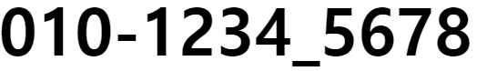
- :before, :after 는 선택한 요소의 가장 앞, 뒤에 생성된다. content 속성과 함께 짝지어, 요소에 장식용 콘텐츠를 추가할 때 사용한다. 예를 들어, 핸드폰 번호에 하이픈(hyphen)을 추가하거나 할 때, 사용하면 유용할 것 같다.
<section class="firstrow">
	<h2>010</h2>
	<h2 class="hyphen">1234</h2>
	<h2>5678</h2>
</section>
.hyphen::before {
    content: "-";
}

.hyphen::after {
    content: "_";
}
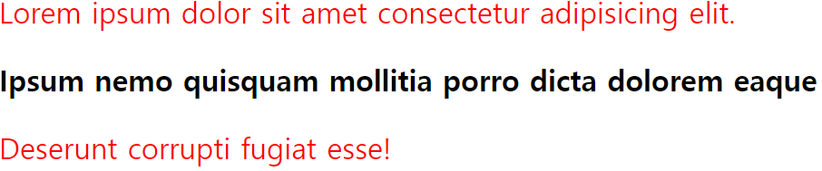
- :not() 은 예를 들어 “A:not(B)” 가 있다면, B 를 제외한 A 전부를 지정할 때 사용한다. 예를 들어, 웹 에디터에서 블록 영역내의 폰트 스타일을 바꾸는 기능을 개발할 때, 사용하기 유용할 것 같다.
<section class="secondrow">
	<p>Lorem ipsum dolor sit amet consectetur adipisicing elit.</p>
	<div class="bold">Ipsum nemo quisquam mollitia porro dicta dolorem eaque</div>
	<p>Deserunt corrupti fugiat esse!</p>
</section>
/* .bold 클래스를 제외한 요소 p 선택 */
.secondrow > p:not(.bold) {
    color: red;
}

/* 요소 p를 제외한 .secondrow 클래스 선택 */
.secondrow :not(p) {
    font-weight: 700;
}
댓글남기기